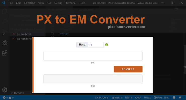
PX to EM Converter
EM is a measurement unit commonly used in Cascading Style Sheets. It is a font-relative unit, which means that it's value is relative to the font-size of it's parent element (read more). This PX to EM Converter eliminates the hassle of converting pixels (px) to em yourself everytime you need to.
How to Use PX to EM Converter
- Step 1: Enter base value.
- Step 2: Input the px value you want to convert.
- Step 3: Press enter key or click the convert button to get it's em equivalent.
Video Tutorial: Convert px to em
PX to EM Conversion Table
The table below displays the common px to em converstions like font-size, break-point, element's min-width, and more. This is given that the font-size of your parent element (some call it container or wrapper) is 16px. You can also use the converter above.
| PX | EM |
|---|---|
| 4px | 0.25em |
| 8px | 0.5em |
| 12px | 0.75em |
| 16px | 1em |
| 20px | 1.25em |
| 24px | 1.5em |
| 32px | 2em |
| 40px | 2.5em |
| 48px | 3em |
| 64px | 4em |
| 96px | 6em |
| 128px | 8em |
| 160px | 10em |
| 176px | 11em |
| 192px | 12em |
| 208px | 13em |
| 224px | 14em |
| 256px | 16em |
| 320px | 20em |
| 480px | 30em |
| 576px | 36em |
| 768px | 48em |
| 800px | 50em |
| 960px | 60em |
| 992px | 62em |
| 1024px | 64em |
| 1120px | 70em |
| 1200px | 75em |
| 1280px | 80em |
| 1440px | 90em |
| 1600px | 100em |

How to Convert PX to EM
Converting the em equivalent of px value is relatively easy. As stated above, em is a font-relative measurement. Which means that whatever the font-size of it's parent element, 1em is equivalent to that font-size.
PX to EM Formula:
em = px / font-size (default is 16px)
This means that if it's parent's font size is 16px. For it's child elements, 1em = 16px.
Difference Between PX and EM
So the difference between PX and EM is pretty simple. Pixels (px) is an absolute unit while em is a font-relative unit which is based on it's parent element.
To elaborate this, say you have an <aside> element with 64px width. It is always 64px width no matter where you put it.
However, it is not the case in em. If you change the font-size of a parent element, it's child elements with em length units will change, too! That's the behavior of a font-relative measurement.
